Along with Ellsworth Kelly, I admire the work of Terry Frost and in both find that their geometry and flat planes of colour hold their own language.
I am still attempting to understand the meaning of 'abstraction'.
Anthony Hill said:-
"Abstract art is a non-mimetic art aiming at an aesthetic of objective invention and sensation, distinctly rational and determinist ... The work is the sum of what is in it and can be considered as the resolving of the situation where all variants of a formalised thematic grouped by criteria are ordered by principles of hierarchy". Terry Frost. Six Decades. Royal Academy of Arts. 2000.
Oh, that explains it then.
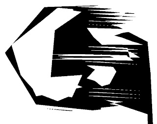
From Terry Frost. 'Black, white and red. Tate, st. Ives, narrated by Mel Gooding.
Terry Frost was a great thinker, philosopher and intellectual. His work has been hugely influenced by walks along the quay at Newlyn, watching the boats rock to and fro, creating arcs as the masts and sails move.
For most of his life, his work showed arc shapes, half moons, parts of circles, triangles and spirals, chevrons, quadroons and rectangles. After some years of personal doubt and depression, he had found his forte.
"....My mood has been one of deep depression and I'm still in a very shaky and queer state. It's partly due to my selling paintings regularly for twelve months, a thing I've never done before and it's very worrying. ...I can't see any point in just painting pictures for sale....I only hope I can get used to this professionalism, for if I don't, I'm a finished man and I might as well do some other job." p 85.
How common is this? Many artists, including myself, hate parting with 'one off' pieces. They are so personal. Yet how will we live if we don't sell work.
 'The value of a line, of a form, consists for us in the value of the life that it holds for us. It holds its beauty only through our own vital feeling, which, in some mysterious manner, we project into it'.
 Worringer.

Black Circle.
Like Ellsworth Kelly, Terry Frost makes a powerful and spiritual statement with a simple geometric shape, divided symmetrically. He uses a considerable amount of black and white in his work but is also a master colourist.
 'I subdivided the flat surface with the Golden Section and the square, so that every geometrical shape was related to every other shape, and then I used colours emotionally.
 p.44

'Just to think in terms of colour is enough to set the soul alight. This is colour without shape - in the spirit. Shapes are known to people by words, but colour can make its own shape and exists in its own right.' From a text for students at Reading, in David Lewis, Terry Frost, Aldershot 1994 and 2000.
Of teaching Terry says'
'The artist wants to be free but tremendous discipline is needed to use that freedom. There is no freedom without discipline. If there is discipline and no freedom, that equals no art, only propaganda. I rely a lot on what has gone before. I am influenced strongly by all the wondrous works I have seen. They convinced me by the subjective sensations I experienced in from of them that art is a real part of our lives. Some people react more than others and to different interests. But to see something that takes you out of yourself into a moment of a new reality, a sensation far removed from our normal reality and all its problems, is a tonic and spirit-builder. One looks, sees and feels a good form.Imagination works separately from reality. It belongs to us before reality. Reality isn't for long compared to imagination.Image, before thoughtbefore narrativebefore emotionImagination thinks and suffers; it's primordial."
 It was a beautiful sunny day in my studio when I painted this image in meditation. It is difficult to see at this size, but it looks like a farmer or person walking towards us over a hill. In the distance, it looks like a hamlet or a farm. It looks as if the 'farmer' has huge wings. I will probably work into this one to make it part of a larger design. I find these images profoundly beautiful - a meaning beyond drawing, linking pure form to absolute simplicity and purity: to sacred geometry and the Universe.
 Tanker. Colours changed from gold and black to white and navy (cutout)
 Tanker. Colour changed from gold to white (cutout)


 Ongoing sketches in various mediums.
 'Ladder' Digital print.
 'Wheels' Digital print.
 However, I am pleased with my progress and with my understanding now. I will continue this study. I do feel that the lorry subject is perfect for experimenting with digital printing.
 'Tanker with rear light', 2009. Crepe backed satin silk.
 'Ladder' Silk crepe backed satin.
 The sound of a pair of crows playing in the trees.
 A bird leaving a trail of sound.
 The twitting song of a wren captured on silk. We have a battle as to who 'owns' my studio. She can squeeze in through the smallest gap and now seems to have a husband.
 Experiments with mixing thick print on dye paste with thick discharge created an exciting third element, a white crustiness cemented into the silk .
  'Spirit' Silk crepe de chine Approximately 9 ft x 18 inches.
 'Spirit' (detail).
 'Summer Dress', V. & A. Museum, 2007
 He often uses black, adding offset collars, non functional flaps and irregular hems, sometimes in white on the black ground, often capitalizing on the effects of light on matt and shiny black.
 In his latest menswear collection, he shows asymmetric coloured shapes on the suits. Often he will have uneven gown shoulder straps, hems and jacket lengths. Many have different cut lengths around a jacket or coat.
 'Star Light'. 1998
 'Aoi Kioku', 1996 'Tiny points of light divided by a large central panel of light'.
 'The Constellation', 1998 Indigo dyed on Turfan cotton.
 'Window 1', 1949
 Black Square
 White Square.
 "Preliminary study for Wall", 1955.
 A version of Mondrian's Tree. - a spiritual journey.

 Bluey black. 1.5G Yellow MX4R
 Colours Black and Aubergine as above.
 On the campsite we wondered why strange animals were kept. They looked like a cross between an Anglo Nubian goat and a sheep.
  Later, we discovered they were the lawn mowers, let out each day to munch the grass between tents and caravans. What a good idea.
 Behind the camp site, there was a farm. Charlotte was fascinated by the beautiful peacocks, about six of them.
 and every night, one would start squawking followed by the rest and this was to continue all night, every night. Then the cockerels would start followed by the campanologists at the local church. On my last night, the peacocks echoed across the campsite and each time they squawked, there followed a cacophony of mimics. Very funny and I was amused that the whole campsite was awake. Hah!
  Andy, Rupert and Patrick.
 Andy and John Miller worked hard to erect the stand and work on time.
 Hanging the work.
 Work hung. No lighting yet.
 We met some of the students from the Dutch stand next to us who had been working with adults with learning difficulties and between them, they created the above seat. I loved Nina Riatano's silicon cups. I chatted to her about the use of silicon on fabric. Laura Pregger's cup lighting was innovative and beautiful. They produced all sorts of constructions during the putting up of their stand but when set up, all that could be seen were a couple of tables. The 'set ups' were for their daily events.
  Each day at 5 p.m. they held a session to attract the customers to their stand, usually involving snacks and drinks.
  The Milan Poli had a line of sewing machines and the students continually made things. On the first day, collars and the second, tee shirts - an 'action' to catch the attention of the public.
 I spent some time with the interesting girl promoting her boyfriends bicycles. The two outside bikes are exercise bikes and the central one is a rideable bicycle. Apparently, he is a very introspective character and I so wanted to meet him, but didn't.
 The Press View and Private View were absolutely crowded and this stand was dispensing free Campari. Alas, I was on a diet and not drinking.
 Olly and Ben we met at the campsite and what interesting guys they were. Olly was planning the Maccu Piccu trip to Peru, something I have always wanted to do.
 I have already talked about my wonderful day at the Zucchi Printing Block Museum. I was surprised to see so many errors in their texts which made me realise just how much precious and historic information I have. I working for David Evans for a whole summer. When exploring ties and visiting Turnbull and Asser, Jermyn Street in London, I found out that some of their ties were block printed by David Evans and there was a tie, the design of which I had engraved at David Evans. I hated working in the design studio. The designs were minuscule and tedious. I eventually worked with the printers in the screen printing department, spending as much time as possible in the block printing area where only 4 block printers remained printing very expensive, exclusive silks. Staff gave me artifacts, photos etc. and the management gave me blocks, strike offs, block printed silks, and even a ledger of hand scripted, piece work pay for the block printers. I was told I could have any information I could write down, record or photograph. I worked like stink for the whole summer while staff worried about their jobs and not about saving the many historic artifacts despite my pleas to give them to a museum. And the blocks, catalogued whilst I was there, ended up in the Zucchi museum in Milan. I later wrote my B.A. thesis on my stay, now a unique and historic document.
 Sophie and Carlo
 On my last night, I couldn't have wished for anything more divine. Carlo runs a family delicatessen. We started with melon, Italian parma hams and Italian cheeses, one we had with honey. Scrumptious! Carlo had made the biscuits and I have not tasted anything like them, a sort of cheesy shortbread with pistachios. We then had the most gorgeous lasagna with bechemal sauce and an Italian wine followed by an apricot tart Carlo had made and again - the pastry was unique and special, just out of this world.